

One of the great dilemmas that all bloggers face when designing a blog is the arrangement of advertising throughout it. In this article, it is intended to be a guide for all those who need some type of recommendations for placing advertising on their blog, either because they are starting out in this world or because they are not receiving the profits that they consider sufficient for their respective blogs. Therefore, we are going to check and compare the designs of some of the blogs in Spanish with the highest visitor traffic according to the Alexa ranking and their advertising, seeing what points they have in common and what they do not.
To carry out this analysis, I have decided to take as an example some of the blogs of two of the best-known and currently most successful blog networks: WeblogsSL and Hipertextual, as well as some independent blogs that I also consider interesting from the point of view of advertising placement.
Group 1: Genbeta, Xataka and AppleWeblog
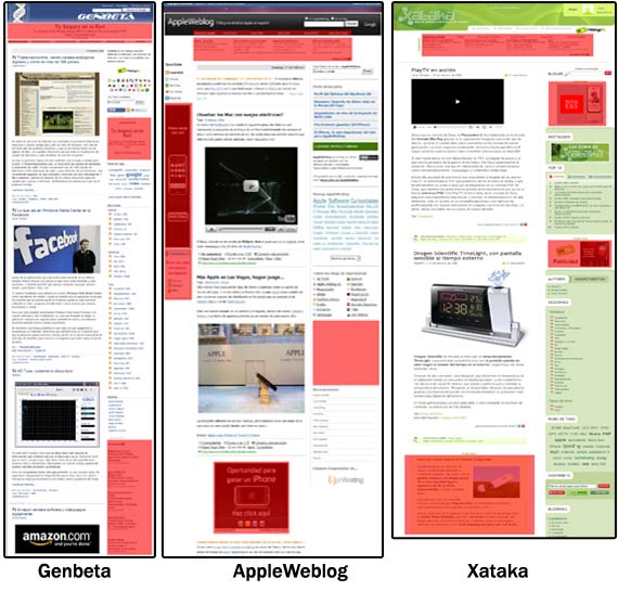
As you can see in the image above (the advertising is marked in red so that it is easier to see), the three designs have in common a horizontal banner at the top (728x90), just below the header. This block, in principle, should be quite profitable, since, on the one hand, it is above the sheet (No need to scroll to see it) and its central position makes it visible to visitors in the first instance. I have tried this format several times on this blog and the results were quite painful, but as they say: ‘Each design is a world’.
In the case of Genbeta and Xataka, in addition, below the aforementioned banner, there is also a horizontal link block just below it (728x15), to which the same as the previous one could be applied in terms of visibility and impact on the visitor.
All of these blogs have advertising in the right sidebar, even though many people think that putting it there is stupid, since visitors generally do not pay attention to that area of the page, so we will be losing a large percentage of clicks/visits. However, we must take into account the height at which this advertising is, since placing it above the sheet generally gives good results, and the lower it is, the worse these results will be, although judging by their positions in Genbeta and AppleWeblog, the conclusions could be different.
AppleWeblog also has a sidebar on the left side, which from experience I can assure you gives very good results too. In addition, it also has a block after the first two posts, although I have a lot of doubt about its profitability, although in Xataka they also have it, just much larger. Which will give better results? Well, probably the one from Xataka due to its enormous size, since it can easily be confused with content from the blog itself.
Group 2: Alt1040, Adseok and Microsiervos
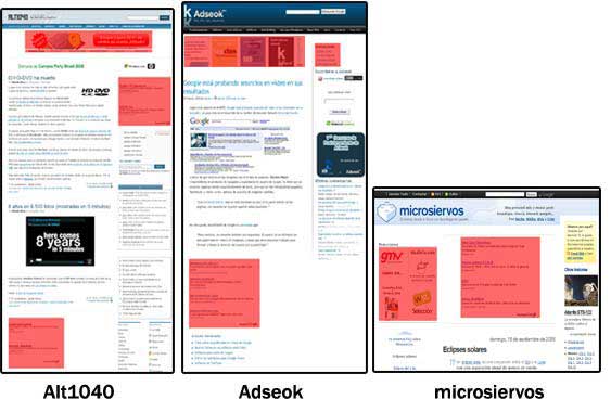
The next group of blogs that we are going to analyze is Alt1040, Adseok and Microsiervos. In Alt1040, which has a new design, we can see that it keeps both the top horizontal block and the link bar just below it, so it certainly seems to give them good results. The design of Alt1040 is quite similar to that of Xataka in terms of the layout of the advertising, since it also has an ad unit in the upper right part of the sidebar.
As in AppleWeblog, after the first two posts there is an advertising block, only, in this case, aligned to the left.
In the case of Adseok, it is not the main page, but an article page, since both share a block of links in the upper right and they only differ in that after the article there is another ad block aligned to the left (336x280).
The case of Microsiervos is very particular, since it is the only blog of those analyzed that only shows advertising to visitors from search engines. As you can see in the image above, it only has some square banners on the left side and the block in the central part that is only shown to search engine visitors (336x280).
Group 3: PuntoGeek and Helektron
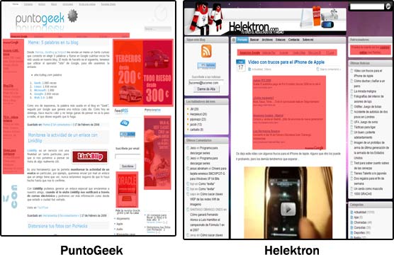
Finally, it is the turn of PuntoGeek and Helektron, which are not as well known as the previous ones but are worth studying.
First of all, PuntoGeek stands out at first sight because of the enormous amount of advertising it has. At the top it has a horizontal link block (728x15), on the left a vertical banner (120x600) and at the top right a large 336x280 block. In addition, it also has some small banners in the right sidebar.
Generally, by placing more advertising we will not earn more, since there are factors such as CTR (Clicks / visits) that also determine earnings, while the more advertising we have, the worse the user’s navigation will be, so we will have to be very careful regarding the quantity and disposition of it.
In the case of Helektron, there is only one top (460x15) and one large (336x280) link block before the first post, and I am aware that they produce very good results due to the theme of the blog and the origin of the visitors.
Conclusions
It is difficult to find an optimal position for advertising within a blog, since it largely depends on its distribution. However, it must be taken into account that the majority of blogs analyzed have an ad block at the top, and that the majority of those that use ‘semi-square’ blocks are 336x280 (the largest available in Google Adsense).
As always, the most effective way is to try new combinations week after week, since it is very difficult for us to find the ideal combination the first time. I hope this post has been helpful. :)