
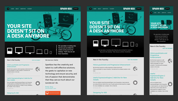
Since the arrival of HTML5 and CSS3, Responsive Design or “Responsive Design” is a new technique that is beginning to be used more and more. It basically consists of adapting the designs of web pages depending on the size of the browser window, changing as it increases or decreases and without the need to have several versions of CSS or HTML.
You can see a small example **if you resize the blog or if you see it in an iPadSmashing Magazine or on my personal page.
The example that I am going to propose is very simple and only has 3 steps: Add a meta tag to the header, add compatibility with old browsers and make modifications to the CSS.
1. Add the meta tag for the scale
First of all we must add the following code between the “” tags of our page.
<meta name="viewport" content="width=device-width, initial-scale=1.0">Basically what this tag does is adjust the width to the width of the device (be it a browser or a mobile device) and indicate that it should not be zoomed initially.
2. Add support for older browsers
As older versions of Internet Explorer do not support the “viewport” meta, we must add a javascript that performs its function.
<!--[if lt IE 9]>
<script src="https://css3-mediaqueries-js.googlecode.com/svn/trunk/css3-mediaqueries.js"></script>
<![endif]-->
3. Apply modifications to CSS
Now we will have to write the necessary CSS code that we want to modify the resolution function. I am going to use as an example the CSS that I have used to move the sidebar below the content when the device resolution is between 700px and 1000px (that is, to work on an iPad).
The operation is the same as if we used a conditional.
@media screen and (min-width: 700px) and (max-width: 1000px) {
*Todo lo que añadamos aquí se utilizará solo en resoluciones X, donde 700px<=X<=1000px*/
}
Now with the new CSS code to move the sidebar so that it does not allow floating elements on the sides and adjust the entire layout to 700px we would have something like the following:
@media screen and (min-width: 700px) and (max-width: 1000px) {
#container{
width: 700px;
}

#sidebar-content{
clear: both;
width: 100%;
float:none;
}
}
Keep in mind that all the code is inside the conditional and that we could play with the values of this in such a way that we show a code at smaller, larger widths or between two other values. The possibilities are quite extensive.
You may also be interested…
| More Information | Web Designer Wall Inspiration | DesignModo |
|---|
*Take into account the date of this post. If it’s been a long time, chances are the javascript or some link isn’t working.**