
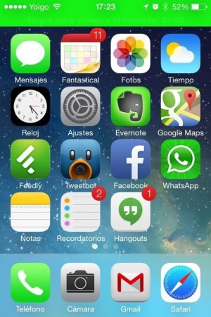
 Demasiado brillo y colorido son las primeras impresiones que me he llevado al probar por primera vez iOS 7. En lo estético, Apple se ha decidido por unos diseños planos, muy planos y muy peculiares que no gustarán a más de uno, porque hacen parecer tu móvil un juguete. Lo curioso es que en la web de Apple el diseño encaja perfectamente con el iPhone, pero echad un vistazo y decidme cuantos iPhone negros con iOS 7 muestran (los colores claros, con el blanco van muy bien, pero con el negro…).
We’ll have to see how it evolves in subsequent versions, but if the functionalities are already definitive, it wouldn’t be bad if they tried to give those icons another spin (phosphorescents, without margins and unbalanced). Some designs that are too personal for my taste.
It must be recognized that we have had practically no changes in the interface since 2009 and that a change was necessary because Android and especially Windows Phone have improved a lot in appearance, but perhaps I miss greater customization and being able to deactivate certain aspects of the interface, such as the 3D desktop background or some animations that will surely slow down older mobile phones or a Windows 8-style color combination selector.
It is a “beta 1” and I am sure that there are still many changes ahead, but it is fair to recognize that really necessary things have been improved: Control Center (hallelujah!), iCloud keychain, activation lock, improvements in multitasking, automatic app updates (very important for developers), parental controls, etc. It is logical that people stay mainly in the visual section, especially without having tried it before.
On an iPhone 4S the beta is still very green, so I do not recommend installing it on a phone that is needed daily, especially if you do not have a developer license because you may not be able to go back to a previous version of iOS.